Tuesday, November 22, 2022

Territorial Domination! - cp_chaoscanyon A5 / A6

Patch notes

A5

- Redesigned C point
- Added new entrance to C route from B
- Added slight buffer to B spawn doors.
- Added route to B pint that leads to A point route
- Added some signage

A6

- Changed spawn room layouts for A, B, and C
- Added second spawn door for C
- Opened C a bit more and added side routes back to spawn
- Made the connecter area between A and C a bit wider
- B now takes 1 less second to cap
- Made A point visually more distinct
- New directional signage in spots
- Gave the points capture names
- New skybox and new lighting

My takeaways are:

1. Even with the rework B is still an issue area. The gameplay on it has been improved but it still has issues with being too defendable and hard to push out of. I think I'm going to redesign the area again.

2. C point is vastly improved vs the old C. There's no giant height difference anymore and it's also visually and gameplay wise a more interesting area. Current issues with it is that it's a bit too defendable. With the B redesign I'm going to hopefully fix this but having routing from B havening the advantage on C.

3. I've had some reflections about the gamemode and I think a pretty big issue I'm having right now is designing he points to be defended. Unlike other gamemodes in TF2 team fights don't happen quite as often and players are more likely to trickle into areas than have a big, organized push.

I don't think there is a way to fix that really, and if there is it'd take way too much time and effort than I'd want to spend. So instead, I'm going to try and cater to how it plays now. I need to make it so points can attacked and defended by a trickle of players. Having spawns be more removed from the areas and points being in a more open / neutral area I think are the first steps to doing this.

4. Some of the routes between areas might be boring? I'm conflicted on making the routes between points actual areas because I don't want people to spend too much time there / set up. Maybe I could have them lead into a lobby type of space?  Not sure.

5. I like the new lighting.

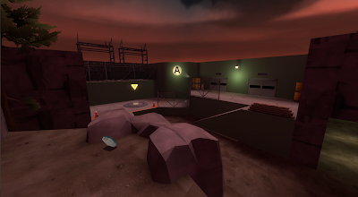
Screenshots below.


Thursday, November 17, 2022

Territorial Domination! - cp_chaoscanyon_a4

 Patch notes for A4:

- New B point
- Changed some routing between B and C
- Changed some routing between B between A to better telegraph a flank route
- Changed C point to favor attackers from B more
- Added prop jump to A
- Added new cover to C


My takeaways from having A4 tested are:

1. B point feels way better to play on. There are still a few defense issues where it's it's able to be hard held by engineers and spawns are still a little too close, but it's overall an improvement. I really like how it feels like an onslaught of attackers when defending, want to try and preserve that if I can.

2. B point SUCKS to push out of. While B is better than it used to be the routes that connect it to the other points are just not good atm. They all favor attackers a little too much but because the point is hard to push into it kinda just stalemates.

3. A point is fine but maybe a little boring? A point seems like it may be the hardest to defend but it's so removed from B and C that it's rarely contested.

4. C is cool but it's problematic. I really like C point and the geo in the little room adjacent to it, but everything about it creates too many issues for B point.

For the next update I think I'm going to focus on completely redoing C point, thinking about setting it inside a giant cavern.  Going to also try and edit the routes between A and B to make pushing through a bit easier and do make some small changes to A and B.

Screenshots below.


Sunday, November 13, 2022

Territorial Domination! - cp_chaoscanyon_a3

 Patch notes for A3:

- Added a second spawn exit for A spawn
- Changed geo on A point
- Added slight flank route to A and B connector
- Made B point spawn slightly further away from cap zone
- Shortened the map a bit
- Added unique color-coded theming to the bases
- Made it so demos and spam inside of B's windows
- Changed theme to alpine
- Added cover to some areas
- Changed skybox to a different hl2 skybox
- Added some of stiffy's tree props

Had this version playtested today and I think I've identified most of the major issues with the layout. Most of it seems to stem from B point being too holdable and connectors throughout the map being too long; it's currently too hard to rotate to other points as their being capped, leading to stalemate-y rounds.

For the next version I'm going to completely redo B point and shorten the connectors between all points.

Here are screens of the current version.


Wednesday, November 9, 2022

Territorial Domination! - cp_chaoscanyon_a2

Patch notes for A2:

- Changed routes between A and B
- Changed routes between B and C
- Redesigned point A
- Changed spawn location at point C
- Added more signage
- Added more pickups


Currently I feel like there's a bit more I can do with the bases and flank routes. I feel like currently a lot of the space's players move through are too tight. If this new version doesn't play any better than the old one, I have a few ideas on how to better fix it but it'll require a ton of retooling the layout.


TCG Design Tips

If you're designing a TCG there are a few things that I personally think you should try and avoid having in your game. These are things that I've learned from making a few games and playing random startups.


1. Boards

I really recommend that you don't design around having a board component to your game. From experience it's a bit of a crutch, it limits the space you have to design in and if you balance around the board your stuck with it forever. Also, if you plan to try and market your game having a board sends mixed singles. Is it a board game is it a card game? It's targeting two audiences that don't really mix too well. Design your game to be played with the cards ONLY.


2. Complex Math

Now, requiring players do math in your game is fine and having players do complex math is fine. The issue is in having players do complex math for the majority of the game. I created a TCG that mechanically played like Super Auto Pets. The mechanics of this work for an automated game, but once you have players sitting down and doing the math as the turn goes it becomes super tedious and boring.


3. Complex Resource System

This extends from the complex math reasoning from before but if your game uses some kind of resource to play cards the simpler that system works the better. In a game I was working on I had a system where players use gold to play cards from their hand, they then could later refund the cards they played for their gold value. Gold would persist though turns and at each upkeep phase players would receive a small amount. 

What I learned from this system is that with so much going on between spending, refunding, and receiving gold at the start of their turns, players would lose track of how much gold they had and too much time was spent managing their gold.


4. Complex Interactions

This also extends from the points above but make your game human playable. What I mean by this is make sure that the number of things that players have to track on their turns doesn't become overwhelming. When they do peoples turns can become too complicated and long and it makes the pacing of your game slow down to a drag.


5. Make your game Breakable

I unironically think allowing players to find interesting combos/mechanics that can create broken situations is overall more fun for players to do. Having your game being a little broken, as long as it's not overbearing, is fun.


To sum everything up, make your game as simple as possible for players to pick up and play. I think simplicity in design, across all mediums, usually works the best.