Lumberyard was a level done for the Core: Arenas of Combat level design contest. The contest had a time constraint of one month; during this time I designed, iterated, playtested, and artpassed a fully playable level. Below was my first iteration of the layout.
This first layout didn't go through many iterations while I was working on it. The also blockout stayed very faithful to the original design, as seen below.
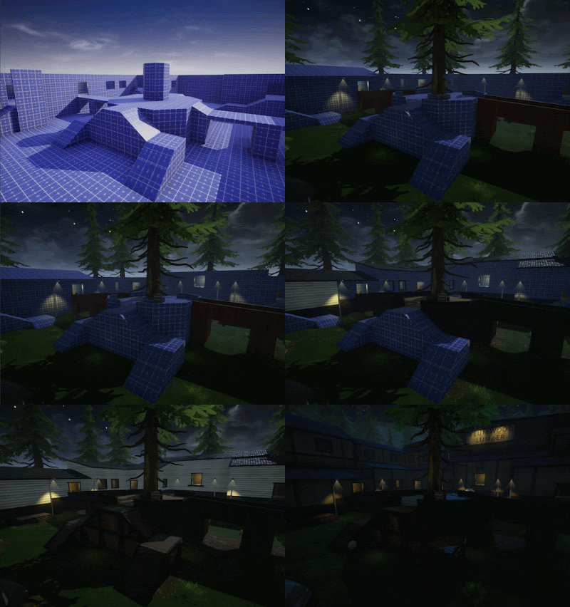
This first blockout was very simple, at his point I was still figuring out sightlines and seeing how everything felt in a 3D environment. After a bit playtesting I began experimenting with slight art passing to try and figure out what kind of space I wanted to create.
At this point the only theming I had in mind was that the bottom section would be a cliff. That choice alone though led me into a more nature-esque lumberyard theme. With this in mind I focused mainly on terrain editing.
This initial basic theming did help me realize the space more. In the screenshots above I added slight height to the back area with an elevated platform and mitigated a slightline through the mid section by making the bridges inclined.
I also created a new interior space in the back that connected the two buildings and also helped to add a more varied gameplay space. The window helps to add a vantage point that players can try and snipe from while the interior makes sure that the window isn't too powerful by being easily flankable and option limited. The railing on the inside also helps to make sure a player standing has to commit to being there, they simply can't strafe to cover if a player outside spots them.
At this point the contest only had about a week left. I decided that layout wise the map was feeling pretty final and began seriously artpassing. Below is a gif I created of the different versions, from a1 to final.


No comments:
Post a Comment